RIVER OTTERS
BRANDING
SPRING 2025
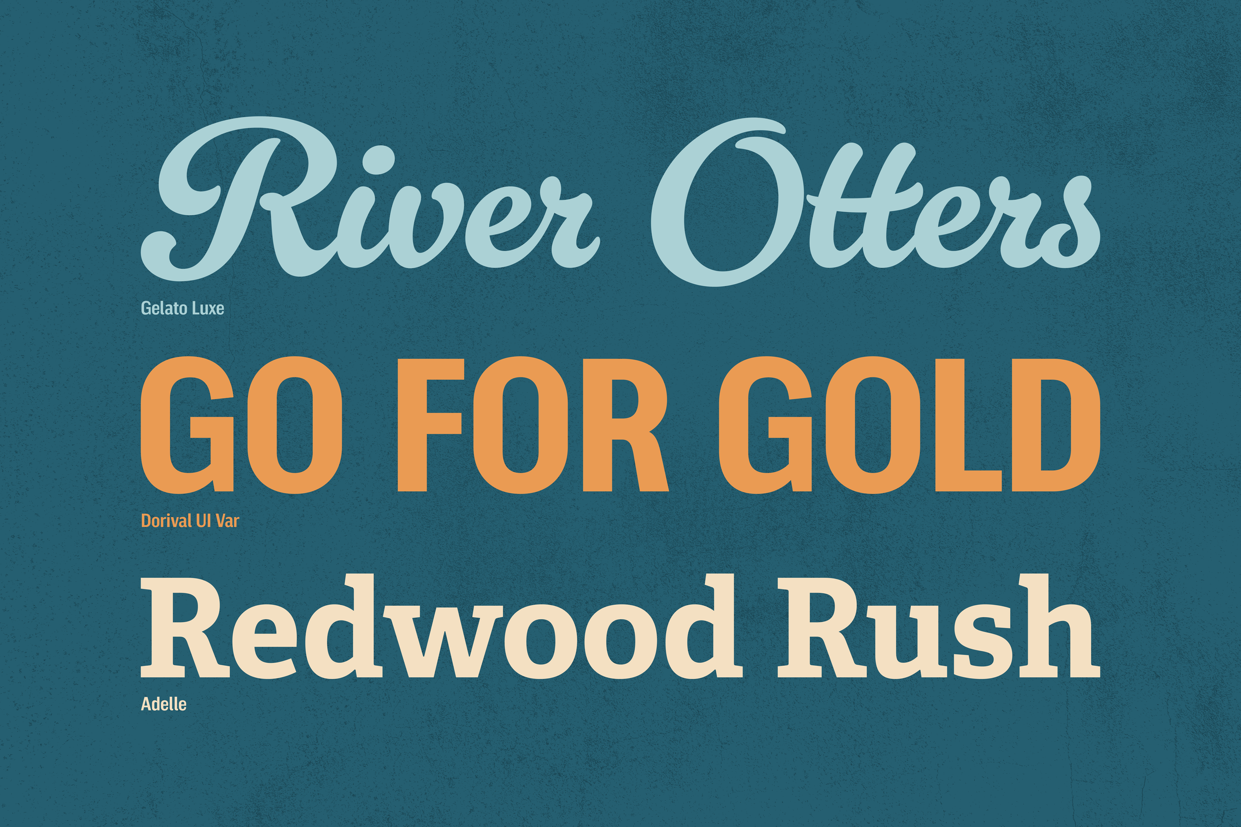
TYPEFACES USED: Gelato Luxe, Adelle, and Dorival UI Var
PROGRAMS USED: Illustrator, Photoshop, and Procreate
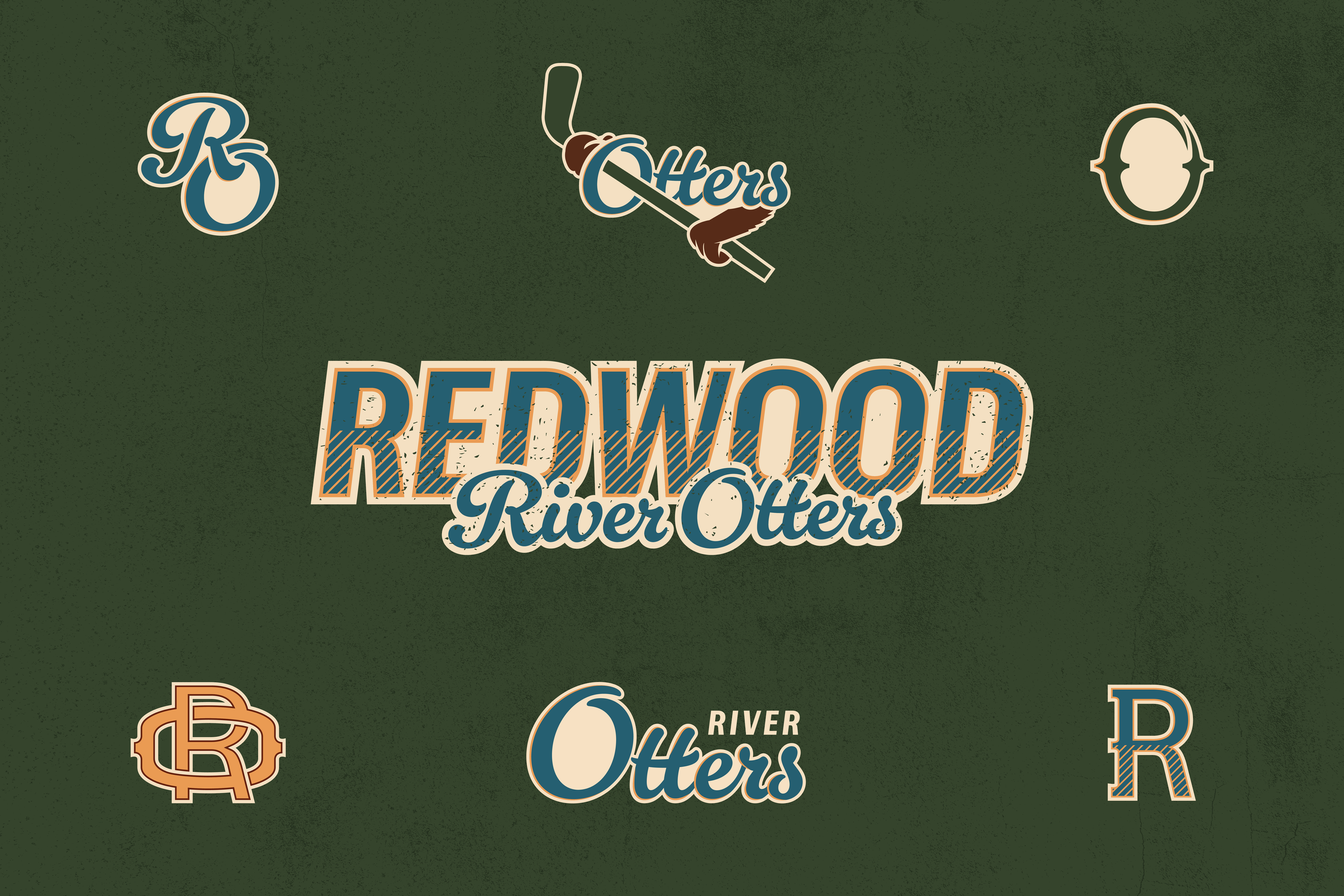
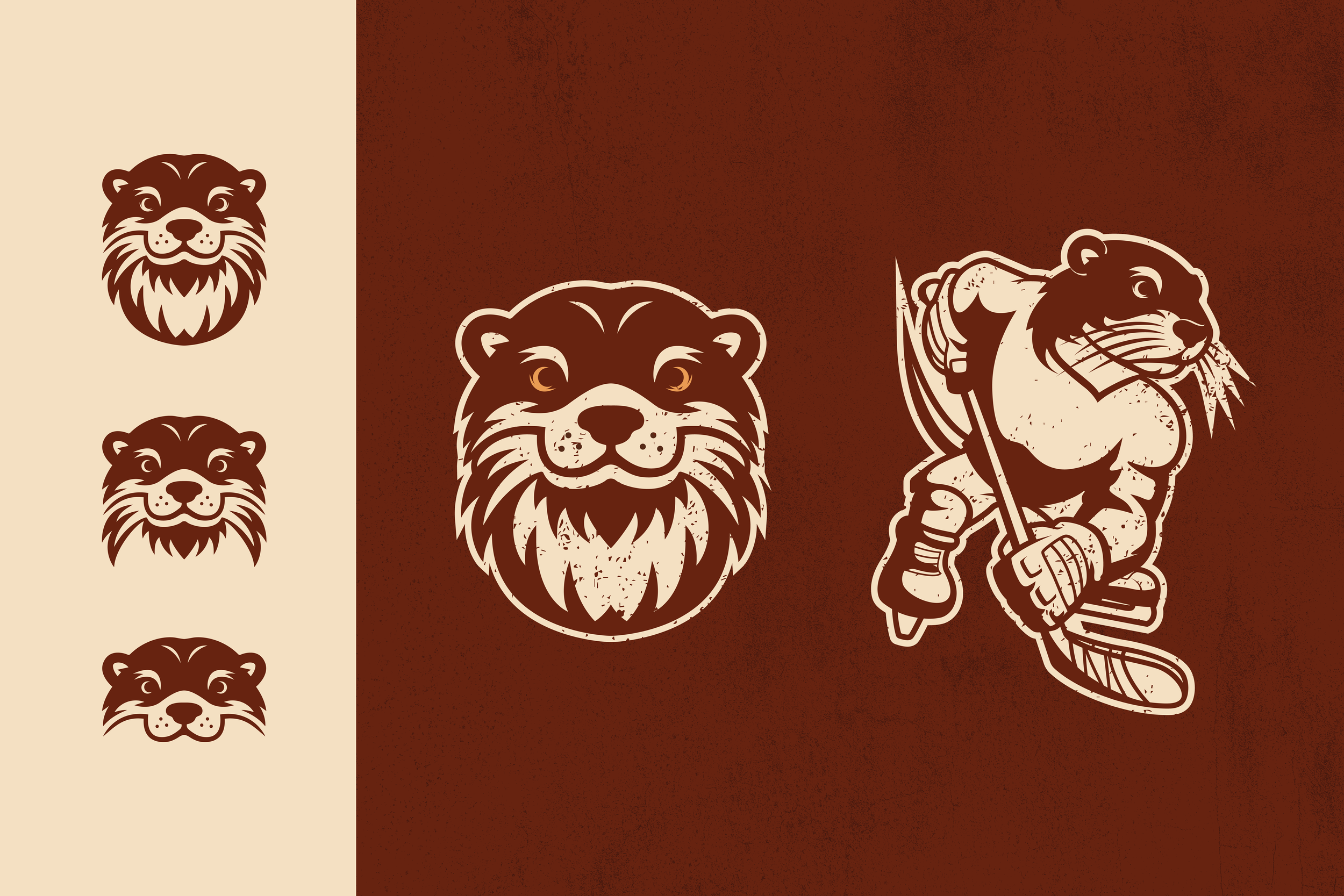
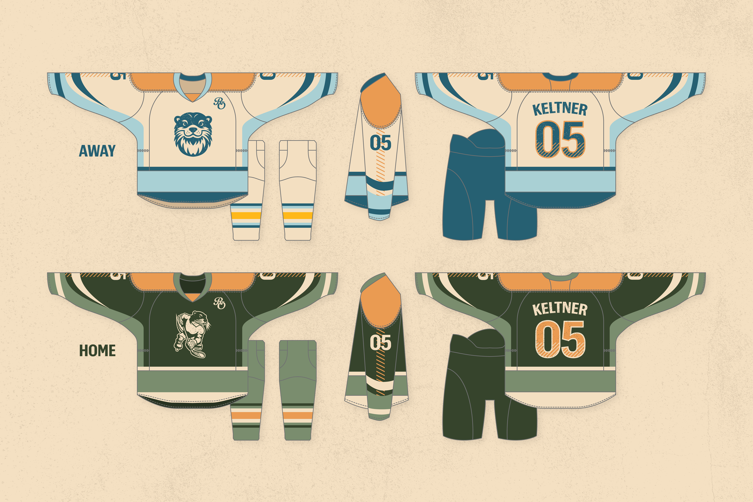
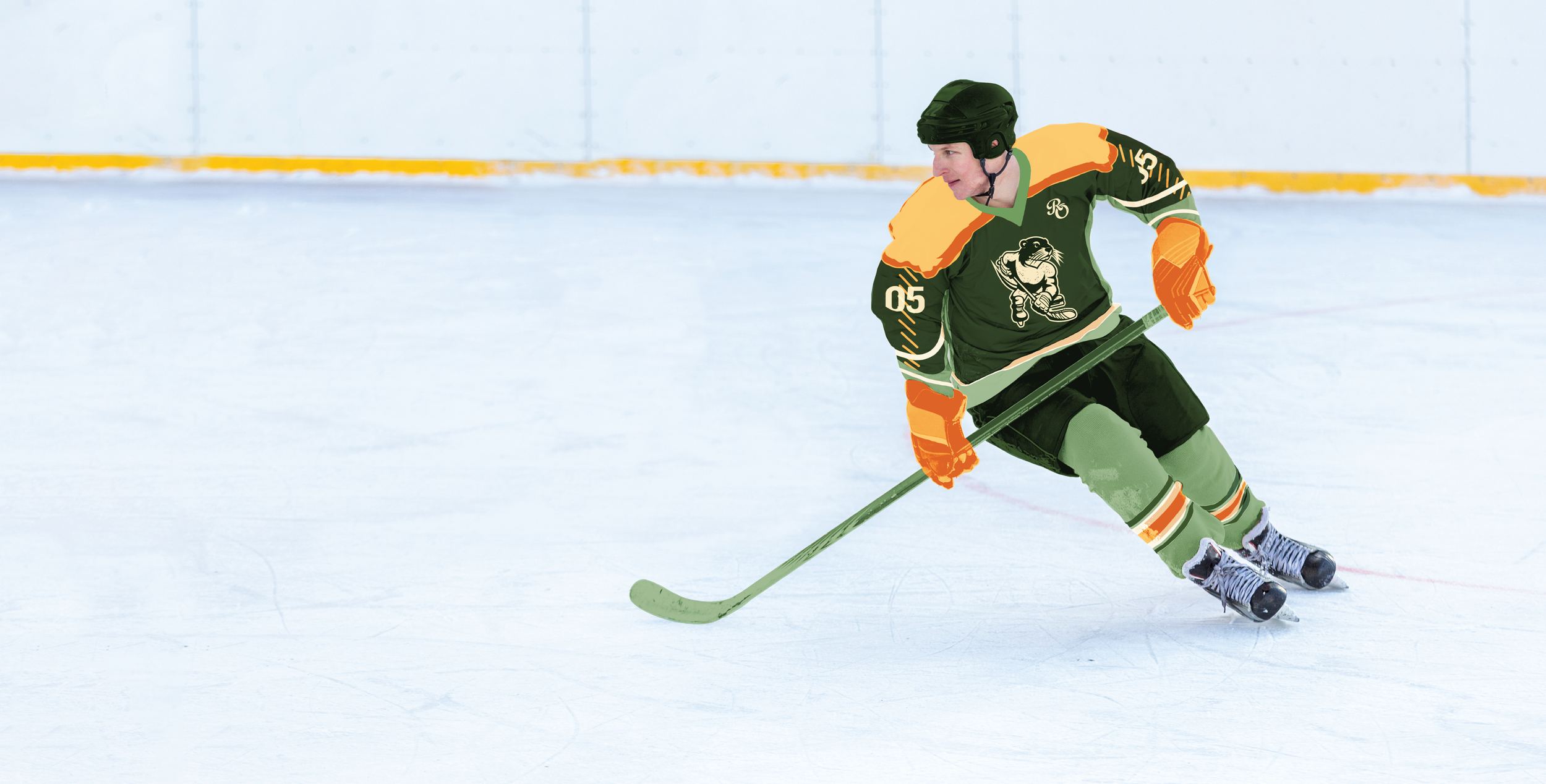
Presented with the opportunity to revisit sports branding, I chose to develop a comprehensive brand system for a hockey team situated in Alaska. The team, known as the Redwood River Otters, draws inspiration from various aspects of Alaskan history and folklore. "Redwood" references an abandoned mining town located four hours from Anchorage, establishing a connection to the state's pioneering past. The "River Otters" element is derived from the legend of the Kushtaka, mythical creatures possessing otter-like characteristics and the ability to shapeshift into human form. Furthermore, the mascot, "Ranch" the River Otter, is named as a playful nod to the creation of ranch dressing in Alaska.
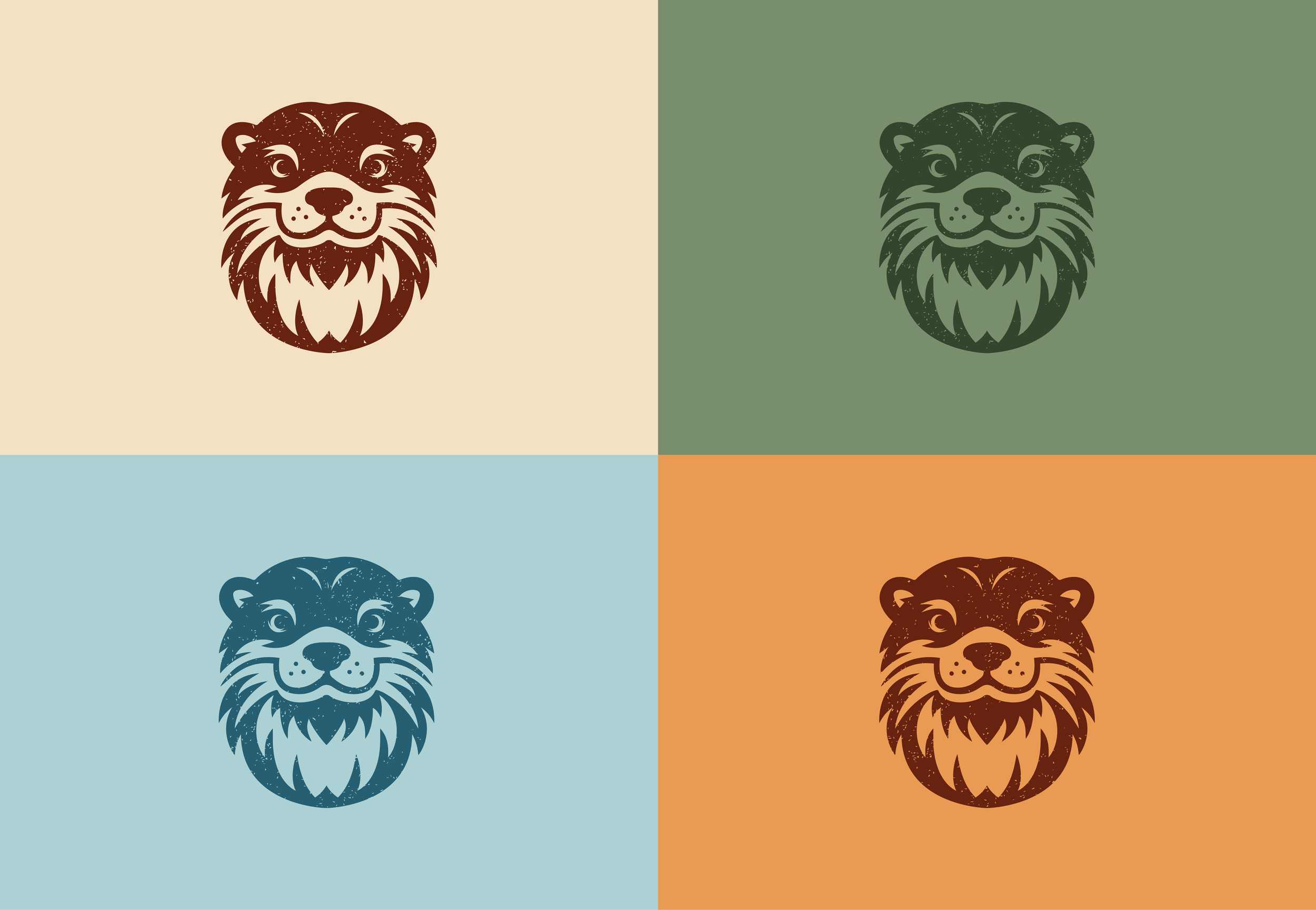
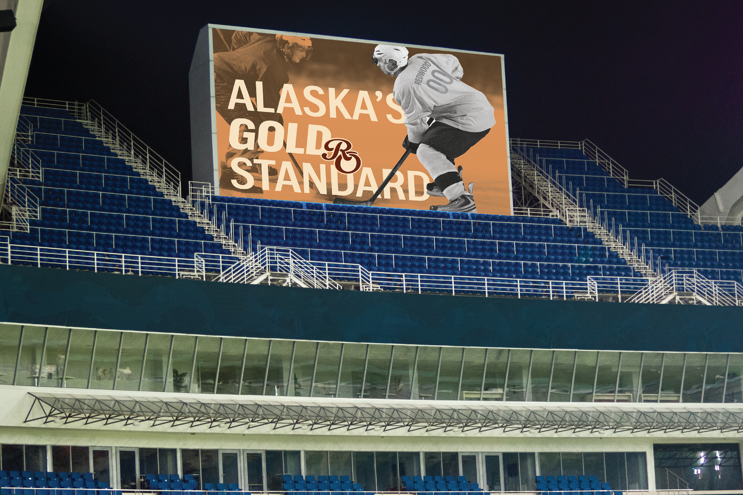
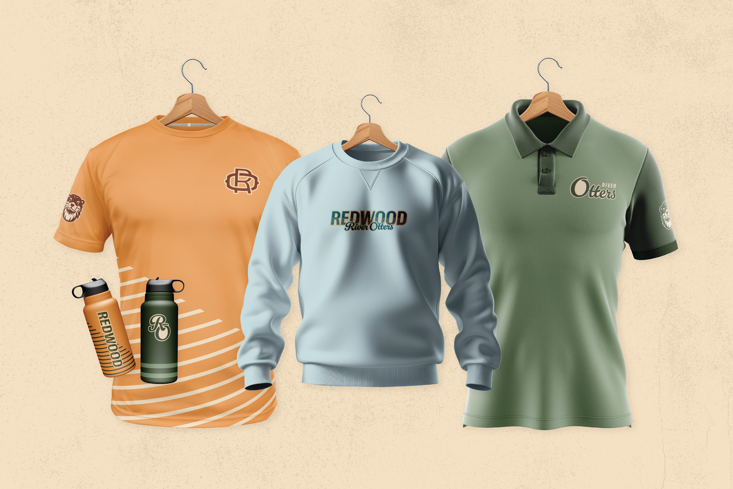
To evoke a sense of historical authenticity, I selected a rustic color palette and incorporated textural elements, lending the brand system a vintage and weathered aesthetic. This, combined with mining-inspired design elements, aims to capture the essence of the Redwood mining town.
Having previously undertaken a baseball branding project, I found it particularly insightful to explore the design distinctions between hockey and baseball branding. Notably, hockey teams tend to favor simpler marks and a broader range of typographic styles. This second dive into sports branding allowed me to demonstrate my growth as a designer.